
Personal Trainer Network

Fitness platfrom
PTN - Crafting a Visual Design Language
#Colors #Typography #Iconography #Photography #3D Illustrations #Print & Media
Summary
The Personal Trainer Network (PTN) was designed to transform how Romanians connect with fitness experts. A crucial element of this transformation was creating a strong, cohesive visual design language that represented the platform’s values—energy, inclusivity, and professionalism.
Project
Health & Fitness
Industry
3 months
Timeline
Lead Product Designer
My role
Andrei Trofin

CEO @ ESX
“We wanted PTN to feel like a breath of fresh air in the fitness space—bold, approachable, and full of energy. The visual design had to reflect that.”
Scope
The goal was to develop a visual design language that was not only aesthetically pleasing but also functional, supporting PTN’s core mission of connecting users with fitness experts.
My role
My primary responsibility was to design a cohesive and scalable visual language for PTN. This involved everything from defining the color palette to selecting typography, iconography, photography, illustrations, and overall brand consistency across all touchpoints.
Colours
#Brand #Content #Background
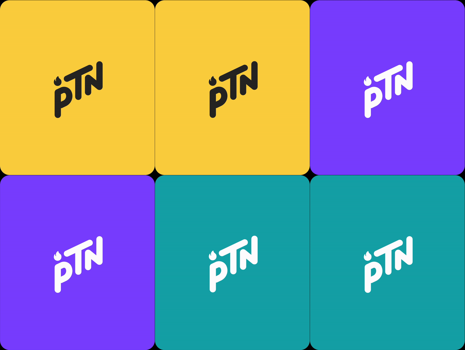
The color palette for PTN was designed to reflect energy, trust, and balance. Our primary color is a bold yellow, representing optimism and energy, while the secondary color is a vibrant purple, symbolizing professionalism and creativity. The tertiary color, teal, adds a sense of calm and stability, rounding out the palette and ensuring a well-balanced visual experience.

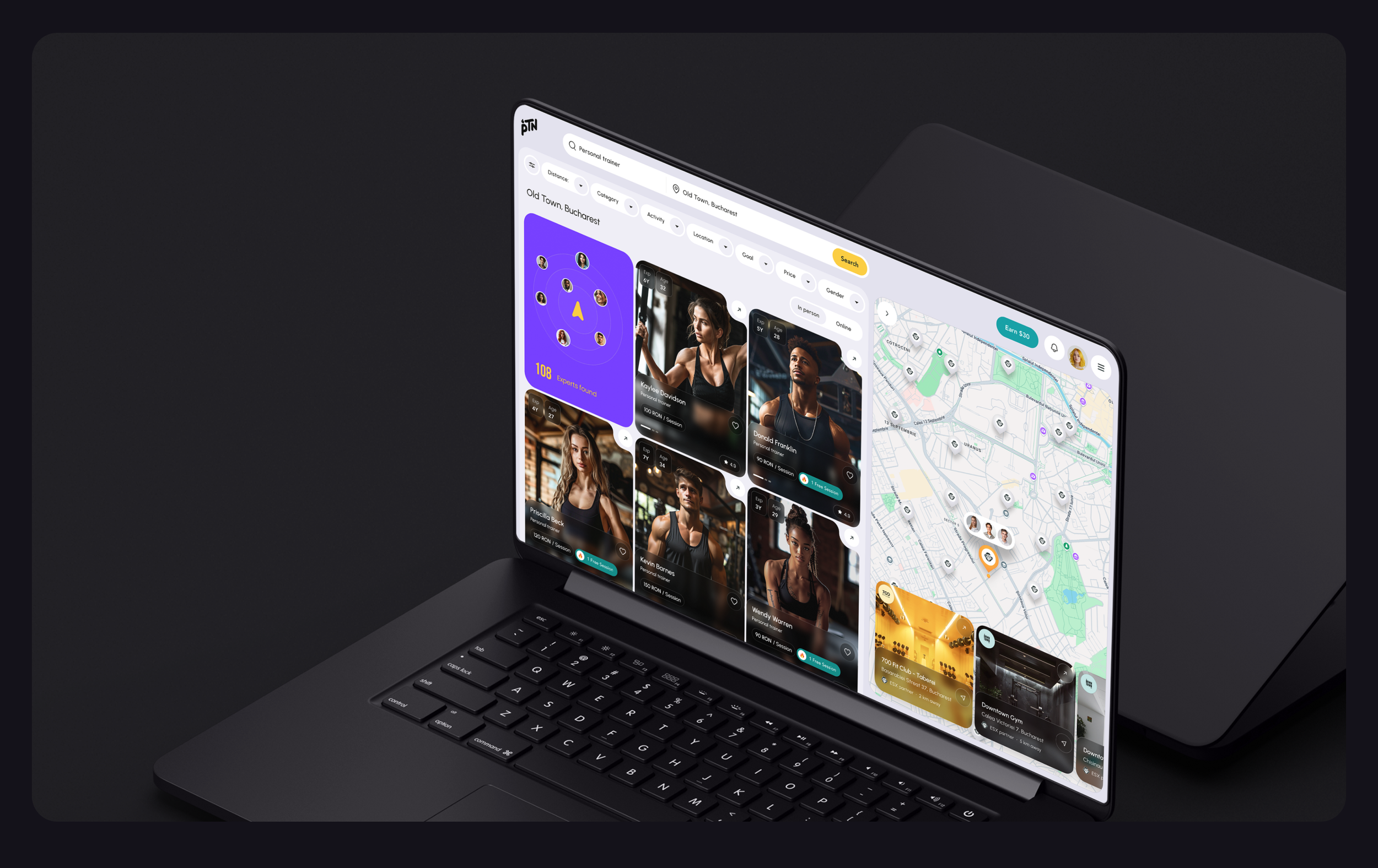
The biggest challenge was creating a visual identity that appealed to a wide range of users and balance modern design trends with user-friendly functionality.
Typography
#Geometric #Sans-serif #Impactful
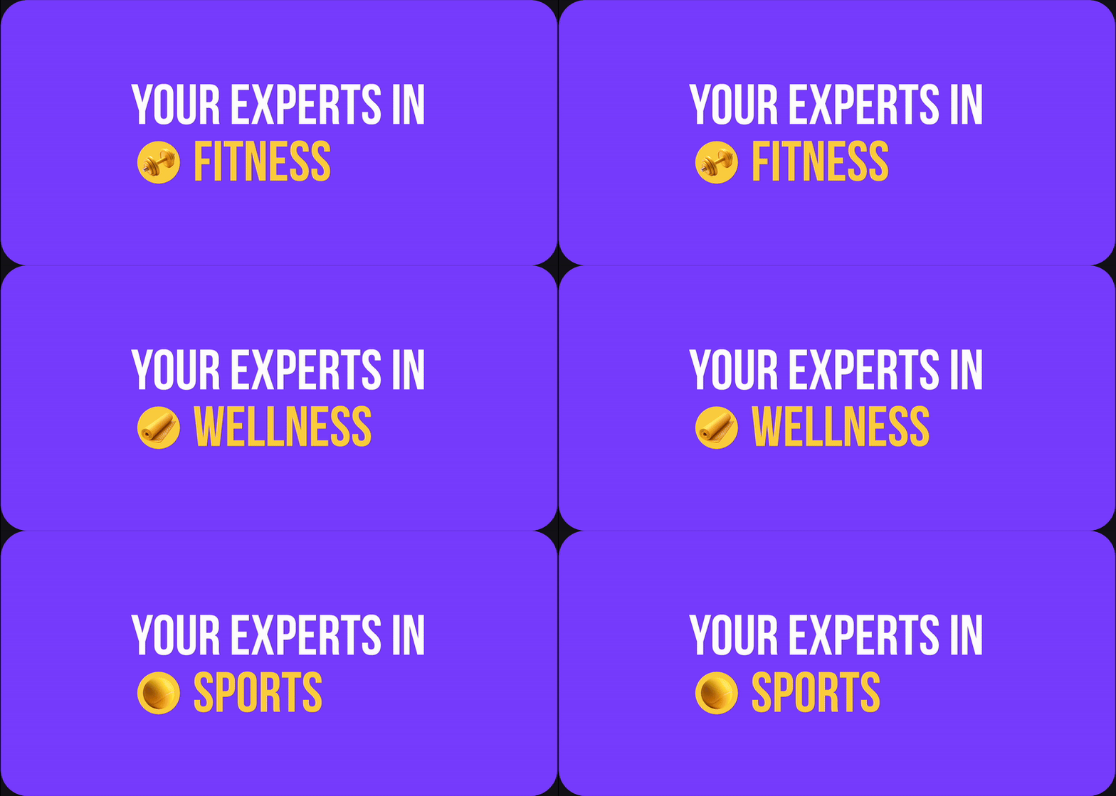
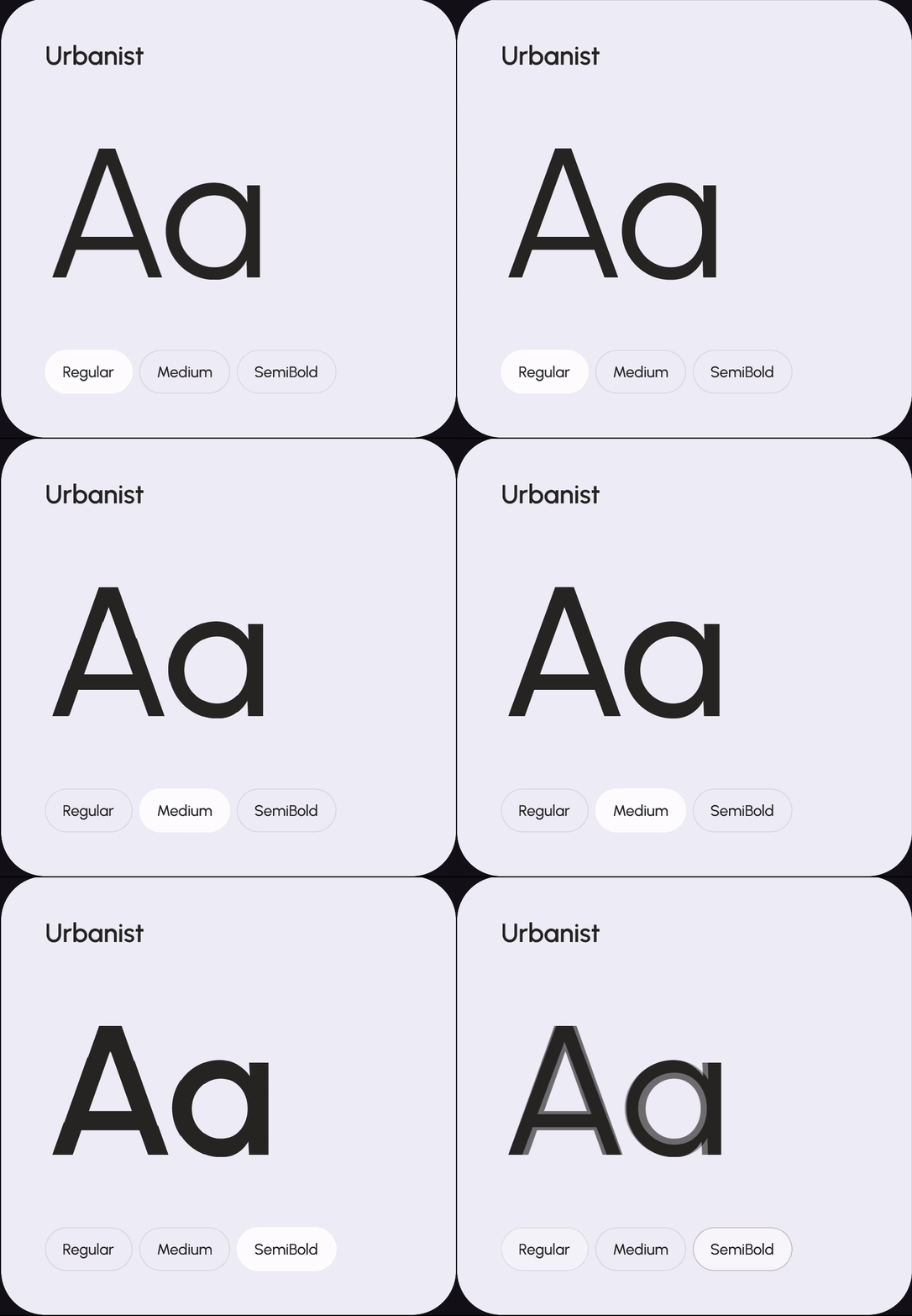
For PTN’s typography, we chose fonts that balance modernity and legibility. The primary font is Urbanist, a clean, geometric sans-serif that feels contemporary and approachable. Bebas Neue serves as our secondary font, providing bold, impactful headlines that grab attention. Together, these fonts establish a clear hierarchy and contribute to the platform’s modern, professional look.


Iconography
Filled Bold • Outlined Subtle
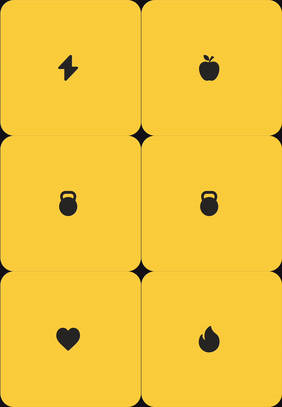
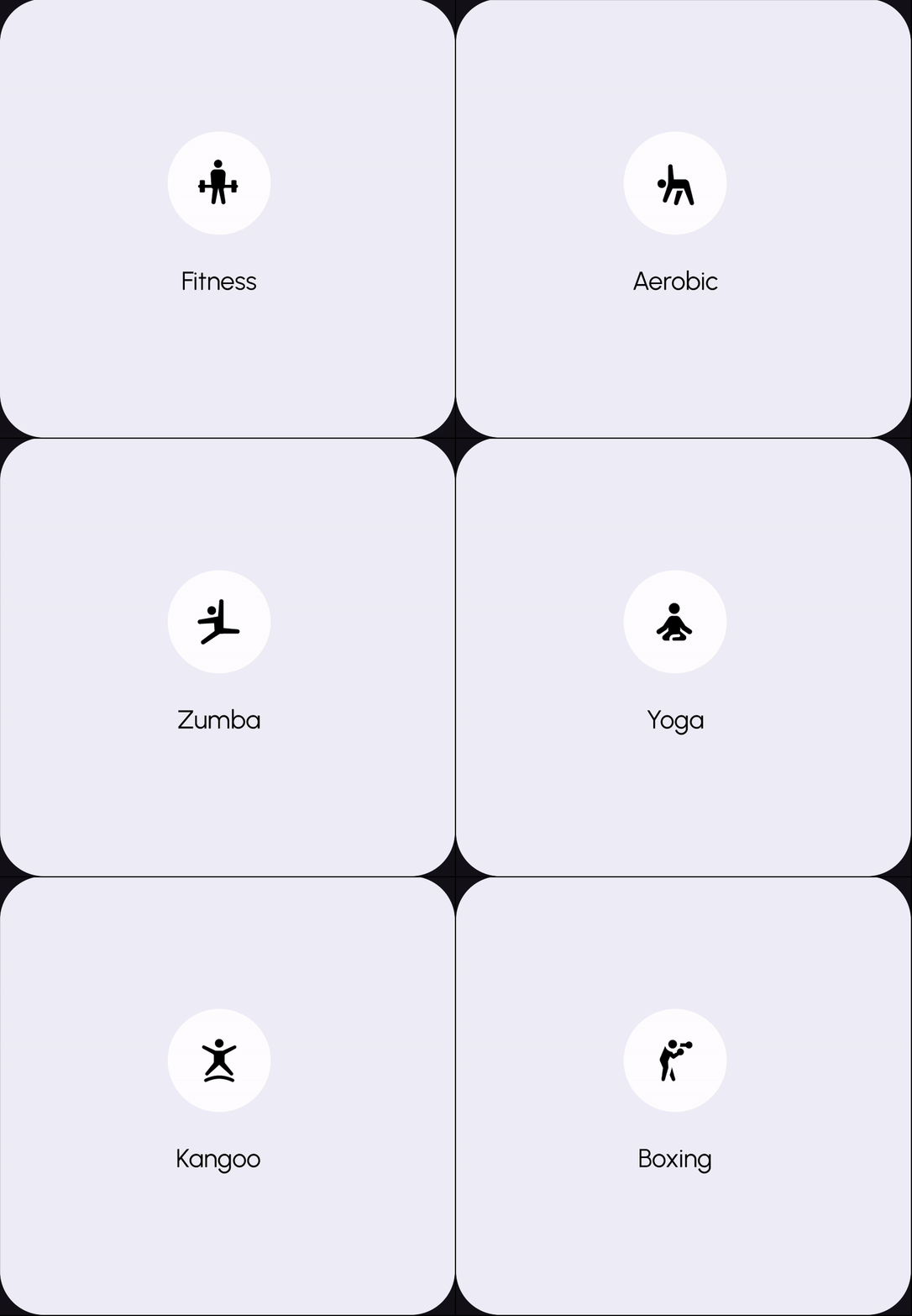
Our iconography was carefully selected to enhance usability and align with the overall design language. We use filled icons for bold actions, adding weight to key interactions, while outlined icons provide a subtle, secondary layer for informational purposes.
Icon style
Icon type
Identity icons
Activity icons
System icons
Photography
#Diversity&Inclusion #Professional #Authentic

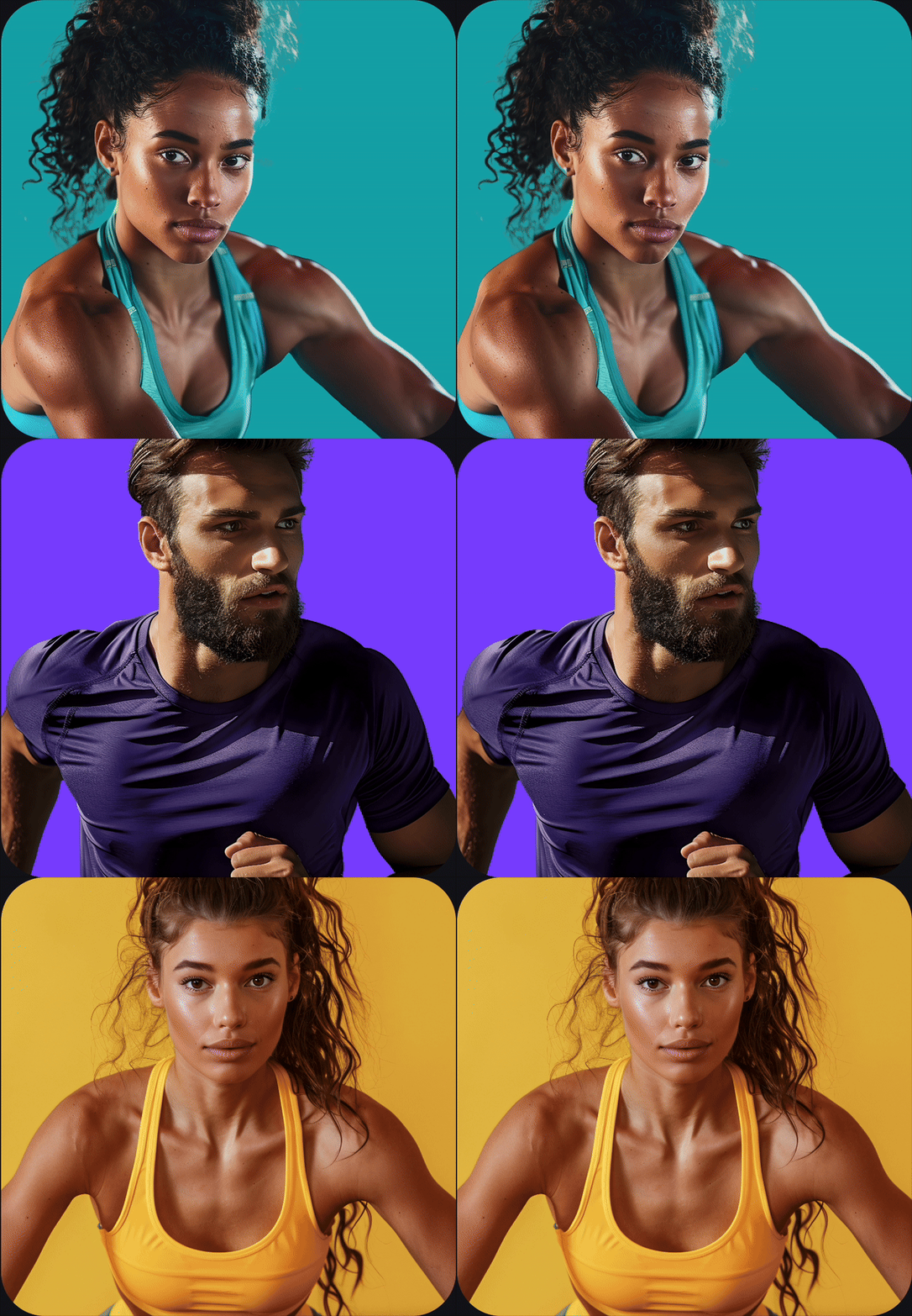
Photography plays a crucial role in establishing PTN’s authenticity. We focused on capturing diverse, real-life interactions, with images that feel genuine and relatable.
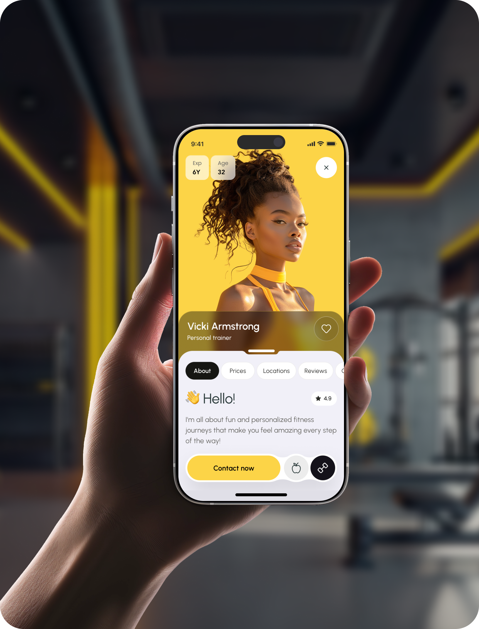
Our photography style features professional portraits for expert profiles and real-life scenarios for background and supporting visuals, often incorporating PTN’s brand colors in clothing or decor.
Professional portraits

Real-life interactions

Illustrations
#3D #Realistic #Equipment
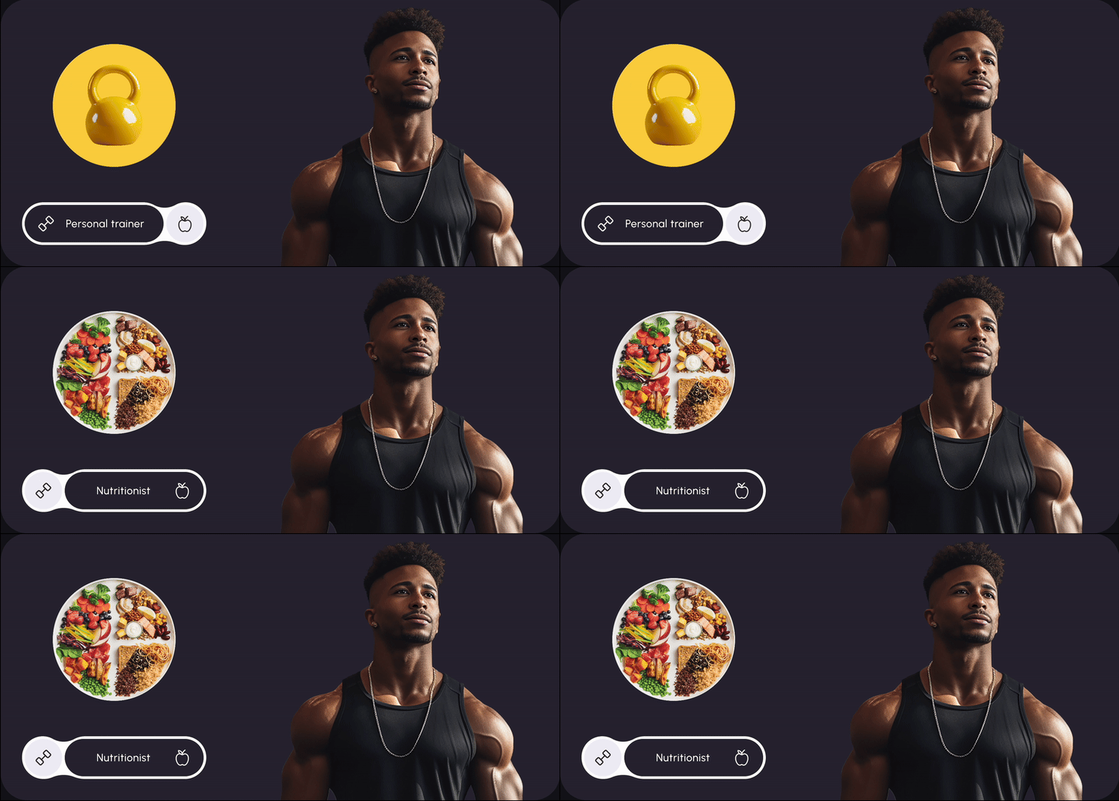
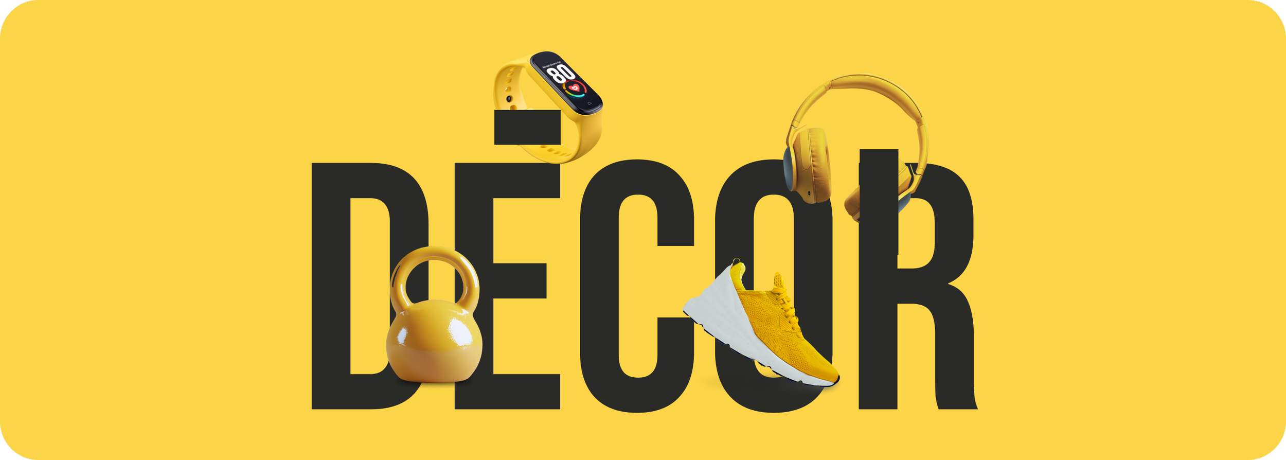
We opted for 3D, hyper-realistic illustrations to support the visual design of PTN. These illustrations are primarily used for equipment and decor items, adding visual interest without overwhelming the interface. Each illustration is colorful, incorporating our brand colors to keep the design cohesive and engaging.
AI 3D renders

Social media
#Bold #Clean #Engaging
Our social media design follows the same principles as the platform—bold, clean, and engaging. We use storytelling through carousels and gallery posts to showcase fitness tips, success stories, and expert insights. Each post is designed to follow a narrative, with coherent order and a strong visual identity tied back to PTN’s core design language.


Marketing
#Colorfull #Impactful #Energetic
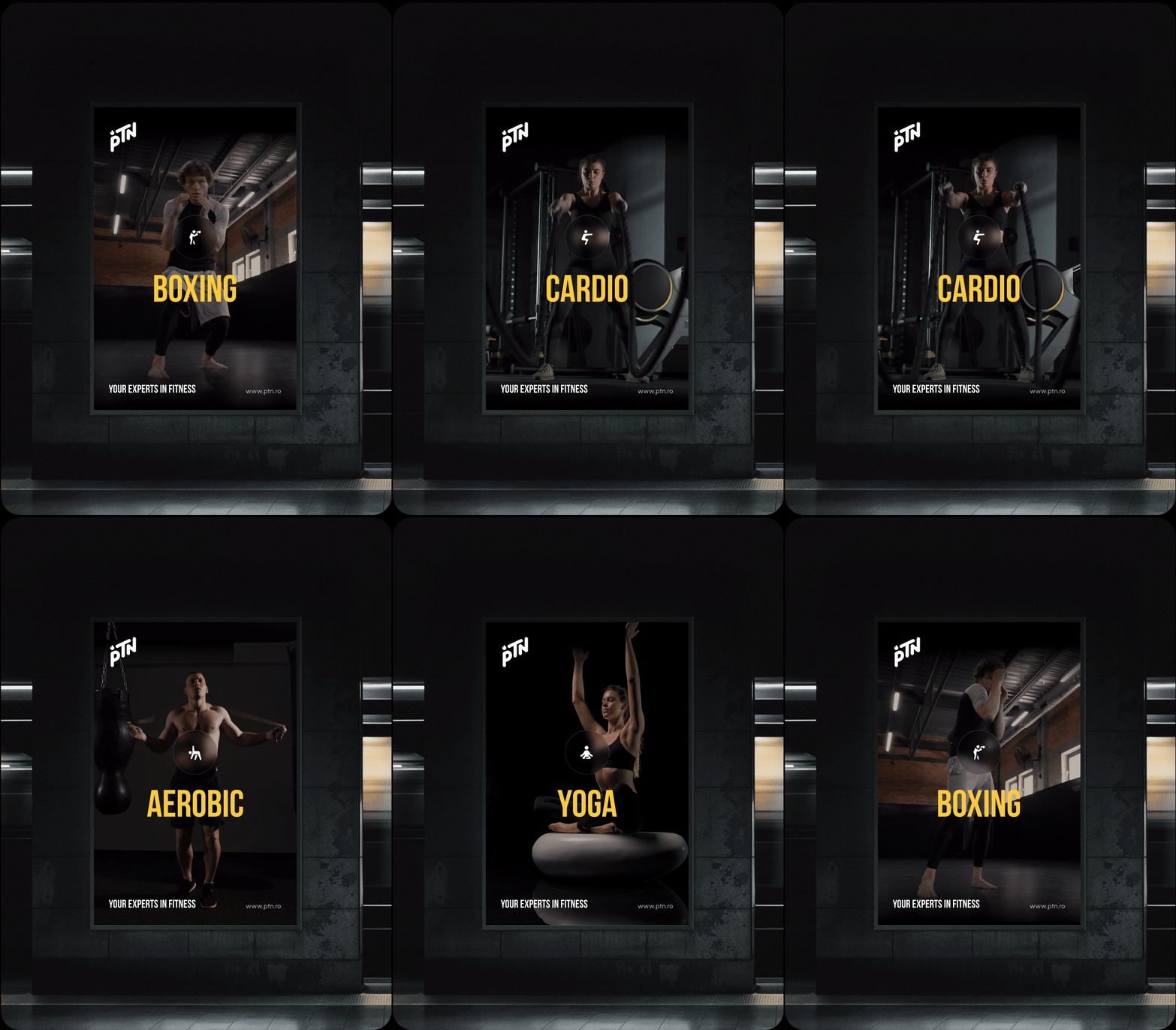
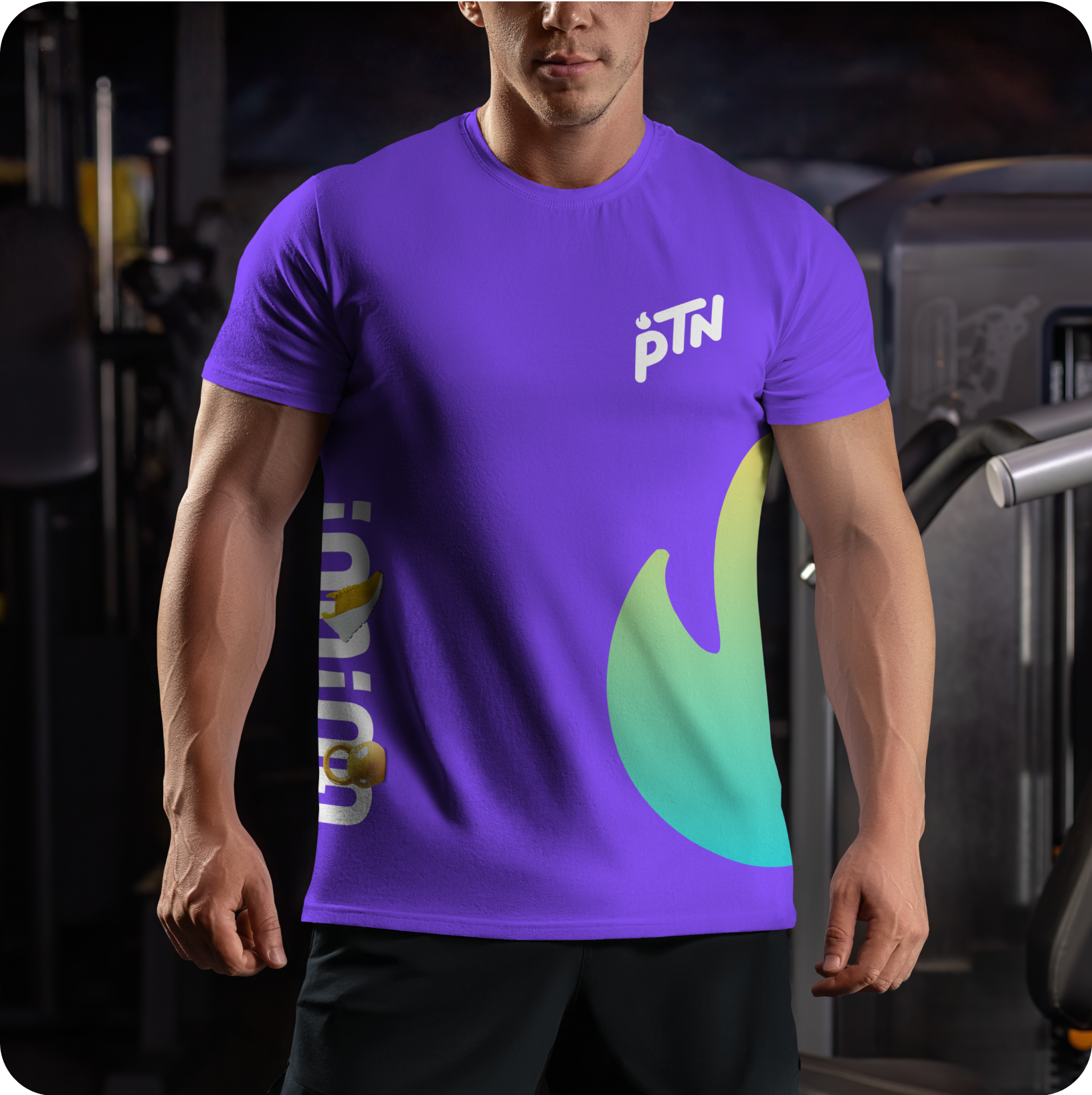
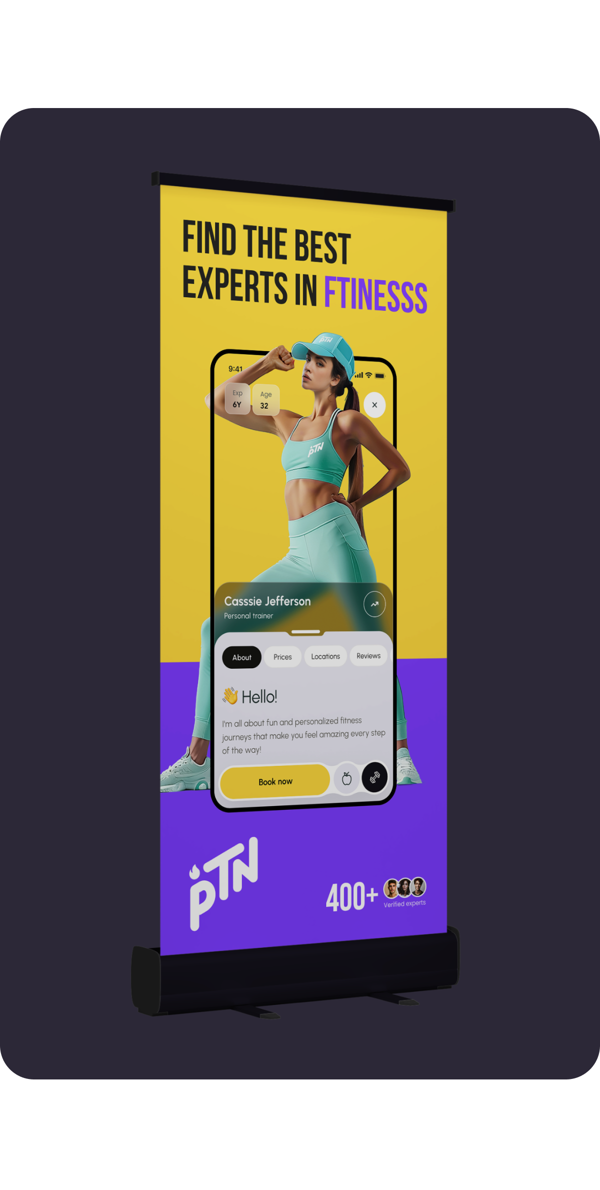
In marketing materials, we maintained visual consistency by using PTN’s color palette, typography, and photography style. The design language helps create a unified brand presence across all touchpoints—whether it’s a social media ad, event, campaign, or digital banner.



Components
#Consistency #Flexibility #Scalability
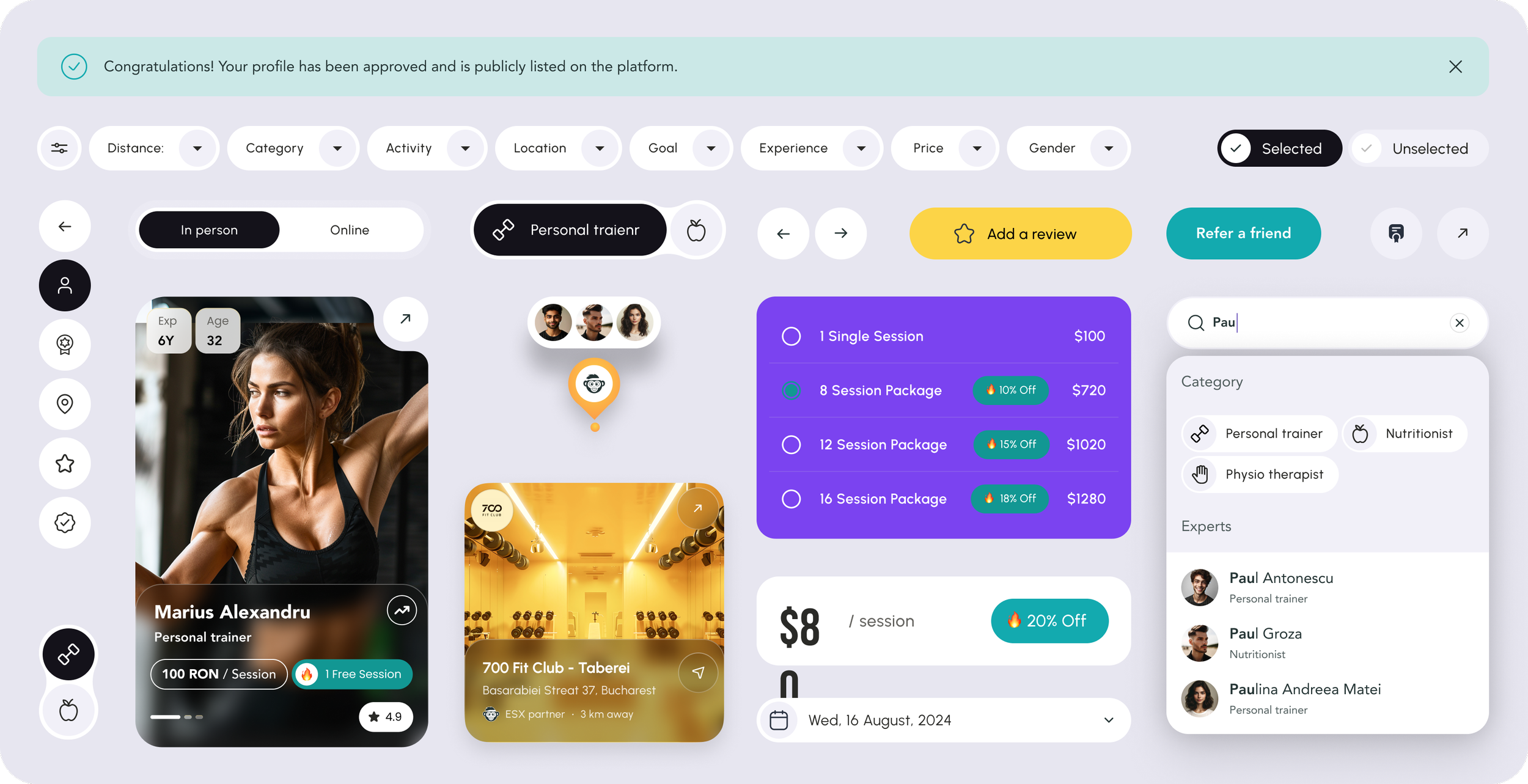
Every UI element followed a modular approach, allowing the design team to quickly adapt layouts and interactions. The design system ensured consistency across all screens. This allowed us to maintain brand identity while offering flexibility for future updates.
Before

After

